


What if the best door color for a red brick house has less to do with your favorite paint chip and more to do with the brick itself? Red brick can lean orange, brown, burgundy, or muted gray, and each undertone changes how a door color looks. The right choice also depends on contrast, architectural style, trim, hardware, and the way the entrance photographs in morning, midday, and afternoon light.
This guide gives you eight decisive options, from classic black and deep forest green to warm wood, honey yellow, and rich teal. Start by identifying the brick's temperature, choose whether you want strong contrast or tonal harmony, coordinate the trim and hardware, then test large samples directly beside the facade. Outdoor light can make exterior colors read 5–10× lighter and more colorful than they appear indoors, so a showroom swatch isn't enough. Colorado brick painting advice can also help you think through preparation before you commit.
Photograph each sample and place the images beside a simple mood board with the roof, trim, landscaping, and pathway. If you're hiring for painting or exterior renovation, HomeProBadge can help you evaluate verified work examples instead of relying on polished promises alone.
1. Classic Black Door
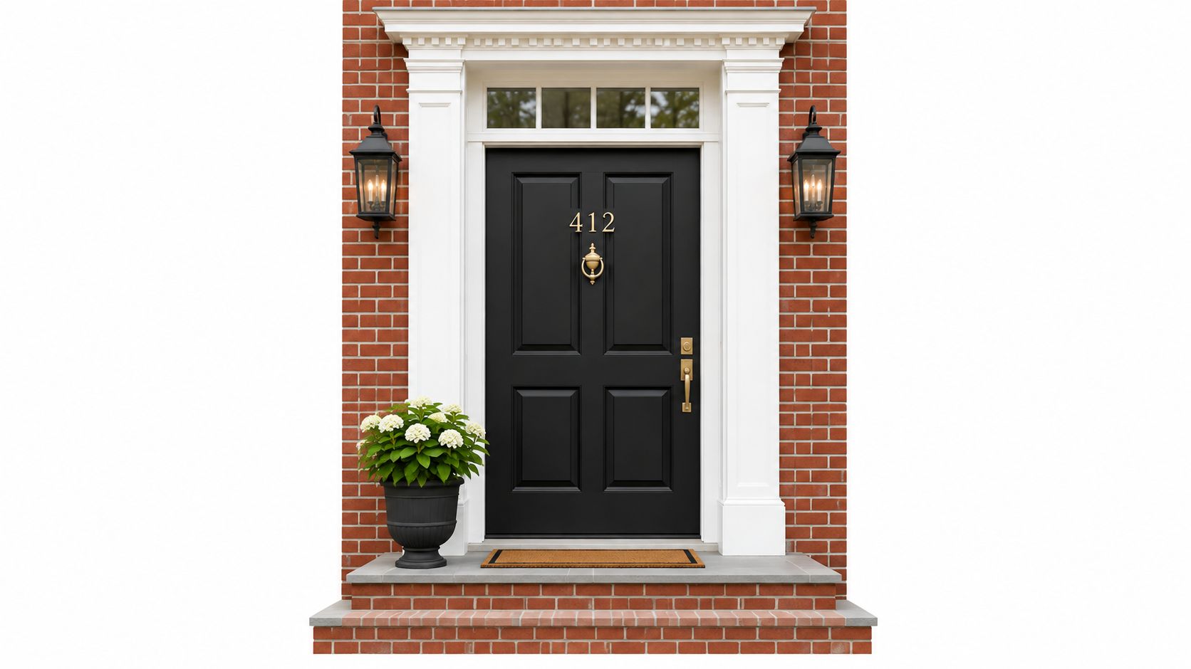
A black door gives red brick the strongest, cleanest contrast. It makes the entrance look intentional and formal, especially when the home has white trim, dark shutters, black lanterns, or a roof with a similarly deep value. On a traditional or Colonial facade, black feels established. On a simpler facade, it creates a crisp focal point without requiring a complicated color scheme.
Choose a soft matte or low-sheen black rather than an excessively glossy finish. A matte surface reduces glare in photographs and keeps the door looking refined, while a durable exterior formulation still protects the finish from weather and repeated contact. If the entrance receives intense sun, inspect the paint specification and follow the manufacturer's preparation and recoating guidance.
Make the contrast look deliberate
Hardware should support the door rather than compete with it. Black hardware creates a quiet, unified effect, while brushed nickel adds a cooler, more contemporary note. Brass or copper can warm the composition, but use those metals consistently on the knocker, light fixtures, and house numbers.
The choice also has unusually strong resale evidence. In a Zillow study of front-door colors, charcoal gray performed strongest for a dark red brick exterior, scoring 100 on the overall index and adding an estimated $3,753 to the offer price of a typical U.S. home. Zillow surveyed more than 2,000 recent buyers and home shoppers, so charcoal may be the more data-backed alternative when pure black feels too severe.
Practical rule: If the brick is already dark or heavily variegated, choose charcoal instead of absolute black. If the brick is warm red with light trim, black can frame the entry beautifully.
For a project portfolio, photograph the black door after the surrounding work is complete, with enough afternoon light to reveal panel detail and hardware. Homeowners comparing the broader cost of hiring painters should also look for proof of preparation, clean edges, and completed exterior work, not just a low initial quote.
2. Deep Forest Green
Deep forest green is the strongest nature-inspired option for a red brick facade. It creates contrast, but it doesn't feel as rigid as black. The pairing works particularly well when the entrance sits near mature planting, a timber porch, stone steps, or a garden with abundant foliage. On a farmhouse or modern rustic home, green connects the door to the setting while allowing the red brick to remain the dominant exterior material.
Use a muted, low-value green, not a bright lawn green. A green with enough black or gray in the formula will look composed against brick and remain easier to coordinate with roofing, trim, and landscaping. Green can shift noticeably in different light, so test it beside both the sunlit and shaded portions of the facade.
Coordinate green with natural materials
Satin is a practical finish for this color. It gives the door enough visual depth to show its panels and molding, but it won't create the hard glare associated with a high-gloss surface. Pair it with black hardware for a grounded look, brushed brass for warmth, or natural wood accents when the architecture already includes timber.
A red brick entry with forest green can look welcoming rather than formal, but the surrounding details decide whether it feels rustic or polished. Keep the trim warm if the brick has orange or brown undertones. A cold, bright white may make the green and brick appear disconnected, while a creamy off-white can join the palette more naturally.
Photograph the door with some landscaping in frame. Warm afternoon light will show the difference between a rich forest green and a flat, nearly black green, while a straight-on image helps prospective clients judge the quality of the installation. For high-sun locations, choose a reputable exterior product and ask the painter how the selected finish will be maintained over time.
3. Warm Burgundy or Wine Red
A warm burgundy or wine door creates tonal harmony instead of maximum contrast. It works best when the red brick has brown, russet, or muted burgundy notes that can echo the door. The result is more refined than a bright red door because the darker, restrained color separates itself from the brick without fighting it.
This is a deliberate choice for a transitional or contemporary home. It can also suit an older brick facade when the trim, lighting, and landscaping have enough restraint to keep the entrance from looking overly themed. Choose a matte or low-luster finish to soften the color and avoid glare, especially if the door faces the camera in listing or portfolio photographs.
Match the red to the brick
Don't select burgundy from a tiny paper chip. Put a large sample board beside the brick and examine it against the warmest and coolest bricks in the wall. A wine tone with purple or brown depth can complement muted red masonry, while a vivid primary red may compete with orange-toned brick.
Buyer response makes saturated red a risky choice for brick. Zillow reported that red can reduce what buyers pay on some exterior types, and on a light brick home it was associated with a potential offer reduction of up to $6,738. That evidence supports a clear recommendation for sellers: avoid bright red on brick and choose a darker, muted wine or a non-red complement when broad buyer appeal matters. See Zillow's guidance on front-door paint colors for the distinction between red's performance on different exterior colors.
Use brass or copper hardware if you want the entrance to feel warm and established. Black hardware creates a sharper, more modern effect. Keep the rest of the facade quiet, because burgundy already supplies color and doesn't need multiple competing accents.
Choose burgundy for cohesion, not camouflage. The door should relate to the brick, but it still needs enough depth and value difference to read as a separate architectural feature.
Photograph this pairing during golden hour, then review the image in neutral daylight. Warm light can make burgundy appear richer and more brown-red, while cooler conditions may reveal violet undertones that weren't obvious at first.
4. Crisp Navy Blue
Which door color gives red brick a sharper finish without the severity of black? Crisp navy blue. It creates polished contrast on a brick Colonial, a clean edge on a contemporary townhouse, and a confident entrance on a modern facade with simple trim. It suits brick that contains cool shadow tones, dark roofing, or blue-gray details.
Choose a true deep navy with enough pigment to read clearly from the street. Pale blue looks disconnected, while an overly gray navy can appear dull in shade. Orange-red brick benefits from navy's cooler contrast. Brown-red brick needs a navy that stays blue rather than shifting strongly toward violet.
Start with the trim, then check the brick. Bright white trim produces a crisp, nautical effect. Warm off-white trim makes navy feel more traditional and less stark. Photograph both combinations from the sidewalk before choosing.
Finish changes the result. Semi-gloss brings out door panels and architectural detail, but direct sun can create distracting reflections and make coverage harder to judge. Satin is the safer choice for a sun-exposed entrance or a softer appearance in property photos.
Hardware sets the final direction:
Navy works better than bright blue when the door needs personality with broad compatibility. Test that assumption on your facade. Paint sample boards in the proposed finish, place them beside both the warmest and coolest bricks, then view them against the trim in morning shade, direct sun, and diffused daylight. Take photos from the approach angle and in close-up. The strongest sample should separate clearly from the brick without overpowering it.
Photograph semi-gloss navy in diffused light so reflections do not conceal coverage or panel detail. If using spray application, check the expected spray paint curing time before installing hardware or taking final photos. A fully cured finish gives close-up images a cleaner, more consistent result.
5. Natural Wood Stain
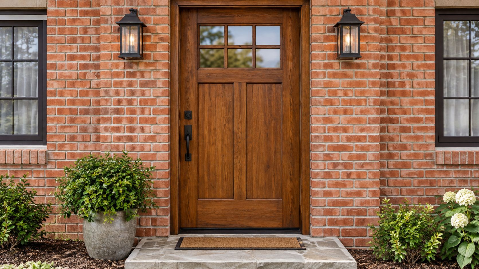
Could a stained wood door give your red brick facade more character than another painted color? Yes, when the architecture and existing materials support it. Medium-dark walnut, mahogany, and related brown stains add warmth, texture, and contrast without competing with the brick's natural variation.
This choice suits Craftsman, rustic, cottage, and historically influenced homes. Use it when the facade already includes timber beams, a wood porch, cedar details, or landscaping with a natural character. On a formal brick exterior, wood can soften the entrance, provided the trim stays simple. Decorative trim, ornate hardware, and several competing materials can make the doorway look crowded.
Choose the material before the stain
Start with the door itself. Solid wood gives stain more depth than a thin veneer, and the same walnut-colored product will appear different on different species. Brush or wipe samples onto the actual door material before judging the undertone.
A satin polyurethane finish keeps the grain visible while adding protection. Follow the exterior product system, and plan for upkeep. Sun, moisture, and frequent handling can alter the appearance, especially at an exposed entrance. Schedule cleaning, inspections, and refinishing when the surface begins to lose consistency.
Hardware sets the temperature of the entry. Aged brass and dark bronze reinforce the stain's warmth, while brushed nickel supplies a cooler, cleaner contrast. Keep the surrounding metals coordinated so the door remains the focal point.
Test the stain against both the warmest and coolest bricks, then check it beside the trim and threshold. View the sample in shade, direct sun, and diffused daylight. Take one close photo and another from the sidewalk. Side light reveals grain, panel construction, and finish quality more clearly than flat midday light. Include the porch and nearby trim in at least one image to confirm that the material transition looks deliberate.
If replacement is necessary, review practical information about the cost of a new door before comparing installation proposals. Ask contractors for completed wood-door projects, including close-ups of the finish and weather-exposed edges.
6. Deep Charcoal Gray
Deep charcoal gray is the most balanced alternative to black. It delivers strong contrast against red brick, but its softer value makes the entrance feel more contemporary and less formal. Use it on a minimalist, urban, or contemporary home where you want a clean focal point without an absolute-black statement.
Choose a warm or neutral charcoal. Blue-gray charcoal can clash with warm orange-red masonry, especially when the brick has no cool tones to support it. A charcoal with subtle brown or neutral depth will usually connect more naturally to red brick, dark roofing, concrete, stone, and modern landscaping.
Let the undertone do the work
Charcoal looks simple from a distance, but undertone matters at close range. Hold the sample beside the lightest and darkest bricks, then move it under the porch roof. If the gray suddenly looks blue, compare it with a warmer option. If it turns brown and makes the facade look muddy, move toward a cleaner neutral.
A matte finish suits minimalist architecture because it keeps the door surface quiet. It also photographs well when the entrance contains crisp lines, modern sconces, or restrained hardware. Brushed nickel, stainless steel, and matte black all work, but keep the metal finish consistent across the immediate entry.
Charcoal has a strong evidence base for red brick. The Zillow front-door study identified charcoal gray as the top tested option for a dark red brick exterior, with a perfect overall index score and an estimated offer-price lift. That makes it a particularly sensible choice for homeowners who want modern style while retaining a measurable resale-oriented rationale.
Take photographs at different times of day. Charcoal can appear almost black in shade and noticeably lighter in direct sun, so the decision should account for the full range rather than one attractive image. Clean the door before photographing it, because dust and pollen are more visible on dark matte surfaces.
7. Warm Honey or Golden Yellow
Could a yellow door make red brick feel welcoming without turning the facade loud? Yes, provided the yellow has enough warmth and contrast. Honey yellow creates a clear focal point and suits cottages, farmhouse renovations, eclectic homes, and period-inspired exteriors where the entrance should feel friendly rather than formal.
Choose golden yellow with warm undertones. Lemon yellow looks too sharp, while pale chalky yellow can appear weak against brick. Compare the sample with both orange and cooler bricks. Strongly orange masonry requires extra care, because a yellow with the same intensity can make the entire entrance look oversaturated. A slightly muted honey shade gives the door presence without allowing it to dominate.
Keep a bright color architectural
Frame the door with elements that add order. Warm cream trim and natural wood reinforce the cottage character. Black lighting or dark hardware gives the entrance a cleaner graphic edge. Bright white creates the strongest contrast, so use it only when the surrounding facade can support that intensity.
Let the entry materials decide the final pairing. If the roof, path, planters, or planting already bring several colors, choose a restrained honey tone. For a quiet cottage effect, combine honey yellow with cream trim and natural wood. For an eclectic entry, add aged brass or dark hardware. For a stronger graphic look, use black lighting and keep the planting controlled.
Semi-gloss is the practical finish. It keeps yellow looking clean, adds gentle reflection, and makes door panels easier to maintain visually. It also reveals dents, uneven filler, and other surface flaws more clearly than a flat finish, so prepare the door carefully before painting.
Test the color in a repeatable sequence. Place large samples beside the lightest and darkest bricks, then view them from the street, the porch, and inside the entry. Photograph the samples during golden hour and in cooler daylight. Evening light can exaggerate yellow, while overcast conditions show whether the shade has enough depth. Include the path and planting in every photograph. The winning color should connect the whole arrival area, not look like an isolated bright rectangle.
8. Rich Teal or Peacock Blue-Green
Rich teal makes the entrance unmistakable. It combines blue's structured contrast with green's organic connection to landscaping, producing a bold option for eclectic, maximalist, and design-forward homes. Against red brick, a true teal or peacock blue-green can look layered and refined, particularly when the brick is relatively consistent in color.
Avoid a gray-teal if you want the door to make a confident statement. Gray can be useful when the brick is heavily multicolored, but it will mute the effect. A saturated teal needs supporting details, so examine the roof, trim, pathway, planters, and light fixtures before selecting it.
Use teal as the focal point
Matte teal keeps the color deep and reduces distracting reflections. Vintage brass, mixed metals, or dark hardware can reinforce an eclectic style, but don't add every finish at once. Select one dominant metal and let the landscaping provide the secondary variation.
Teal is less forgiving than black, navy, or charcoal. It may look excellent on a solid red brick wall but disconnected against masonry with many orange, brown, gray, and cream variations. Place the sample beside the most colorful section of brick and inspect it from the street, not only from the porch.
A bold door needs a quiet frame. Keep the trim controlled, simplify competing accents, and let the teal carry the personality.
Use several photographs to judge it. Capture a straight-on facade view, a closer entry view, and an angled shot that includes the path and landscaping. Review the images beside a mood board before painting. This process is especially useful for contractors documenting a dramatic transformation, because a strong before-and-after image can show both color judgment and workmanship.
For professionals, teal can create distinctive project imagery, but visual impact shouldn't replace proof. Show the completed work from multiple angles, include surface preparation where relevant, and connect the images to a verified project record so homeowners can assess the result with context.
8-Option Door Color Comparison for Red Brick Houses
| Option (Style · Finish) | 🔄 Implementation | ⚡ Resources | ⭐ Expected Outcome | 💡 Ideal Use Cases | 📊 Key Advantages |
|---|---|---|---|---|---|
| Classic Black, Traditional/Colonial · Matte | Low, straightforward paint/replace | Low–Medium, standard exterior paint, hardware | High, formal, high-contrast, professional imagery | Colonial/traditional homes, before/after portfolios | Timeless contrast, highly photogenic |
| Deep Forest Green, Farmhouse/Modern Rustic · Satin | Medium, careful color selection, UV protection | Medium, premium satin paint, quality hardware | High, distinctive, premium aesthetic | Farmhouse/rustic, upscale renovations | Warm complement to brick, memorable curb appeal |
| Warm Burgundy/Wine Red, Transitional/Contemporary · Matte | Medium, requires testing against brick undertones | Medium, quality matte paint, color sampling | High, cohesive, designer-curated look | Luxury homes, tonal remodels, high-end portfolios | Sophisticated unity with brick, reduced glare in photos |
| Crisp Navy Blue, Modern/Contemporary · Semi-Gloss | Low–Medium, standard semi-gloss application | Medium, durable semi-gloss paint, regular cleaning | High, polished, crisp photos with clarity | Contemporary remodels, modern listings | Professional, durable, strong architectural definition |
| Natural Wood Stain (Medium-Dark), Craftsman/Rustic · Satin Polyurethane | Medium–High, wood selection, staining, sealing | High, solid wood, polyurethane, ongoing maintenance | High, warm, authentic, premium presentation | Craftsman, historic restoration, high-end builds | Authentic material, visible grain, timeless appeal |
| Deep Charcoal Gray, Modern Minimalist · Matte | Low–Medium, choose correct undertone | Low, standard exterior paint | High, subtle sophistication, versatile photos | Modern upgrades, versatile architectural contexts | Balanced contrast, non-reflective, contemporary |
| Warm Honey/Golden Yellow, Cottage/Eclectic · Semi-Gloss | Medium, sample testing for warm undertones | Medium, quality semi-gloss paint to prevent fading | Medium–High, vibrant, welcoming portfolio shots | Cottage, eclectic, personality-driven projects | Highly memorable, inviting, photogenic in daylight |
| Rich Teal/Peacock Blue-Green, Eclectic/Maximalist · Matte | Medium–High, precise color-matching, bold choice | Medium, premium matte paint, consistent matching | High, standout, social-media-ready imagery | Eclectic transforms, branded/design-forward portfolios | Distinctive, shareable, positions pro as creative leader |
Turn a Color Shortlist Into a Confident Test
A paint chip is a starting point, not a decision. First, photograph the facade in morning, midday, and afternoon light. Include the brick, trim, roof edge, pathway, landscaping, light fixtures, and any shutters in each image. This reveals whether the entry looks balanced throughout the day or only works under one flattering condition.
Next, place large sample boards beside the brick and trim. Don't paint a tiny square in an inconspicuous corner and assume it represents the finished door. A larger board shows undertone, contrast, and reflected color more accurately. Move it from direct sun to shade, and inspect it from the sidewalk as well as from the porch.
Use this order:
Durability and maintenance should influence the final selection. Darker colors, bright colors, natural wood, and glossy finishes can each show different forms of wear, fading, dust, glare, or surface change. Ask the painter how the selected product is suited to the door material and local exposure, what preparation the surface needs, and how future touch-ups will be handled.
The safest resale-oriented path is a muted, deeper color that complements the brick undertone. The strongest design path may be teal, honey yellow, or burgundy when the facade can support it. Neither approach works if the sample clashes with the trim or changes dramatically in the home's real light.
If you need installation or exterior painting, compare verified professionals with real project photos, structured reviews, and evidence of completed work. HomeProBadge helps homeowners evaluate that proof before hiring, while professionals can use verified profiles and project documentation to show the quality behind their recommendations.
Choose the contrast and undertone that support the whole facade, then validate the decision in the actual light of the home. The best door color for a red brick house isn't the most popular shade. It's the one that makes the brick, architecture, trim, hardware, and entrance work as one composition.
HomeProBadge helps homeowners find identity, background, licensing, and insurance-verified home service professionals with real project photos, video testimonials, and structured reviews. Visit HomeProBadge to compare proof-backed painters and exterior renovation pros before you hire.